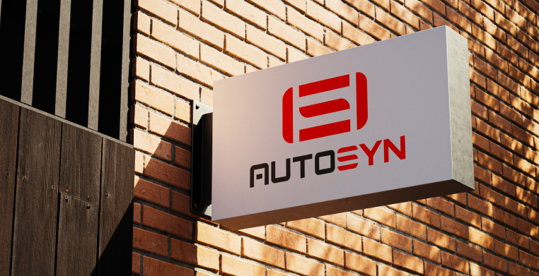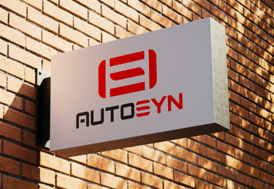
This project began with a completely blank slate — the client had no name, no colors, no visual identity, and relied solely on a basic Mercado Livre store. Working closely with the client and the creative team, we developed the brand name AUTOSYN, establishing a strong and scalable foundation for the business.
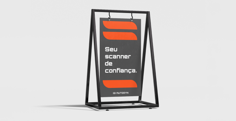
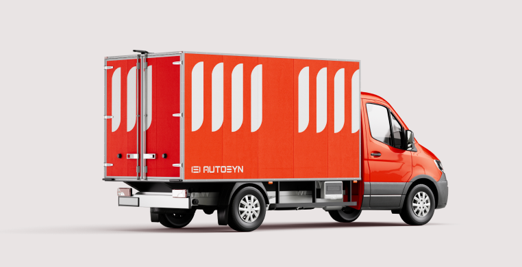
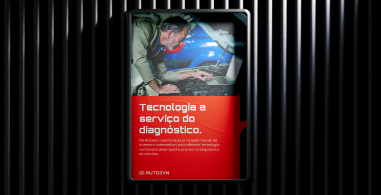
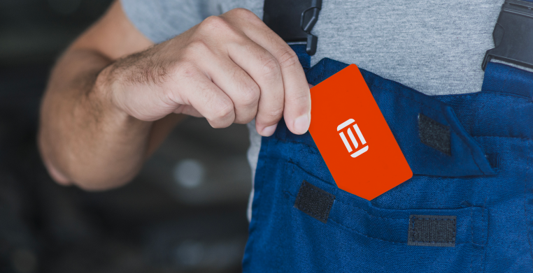
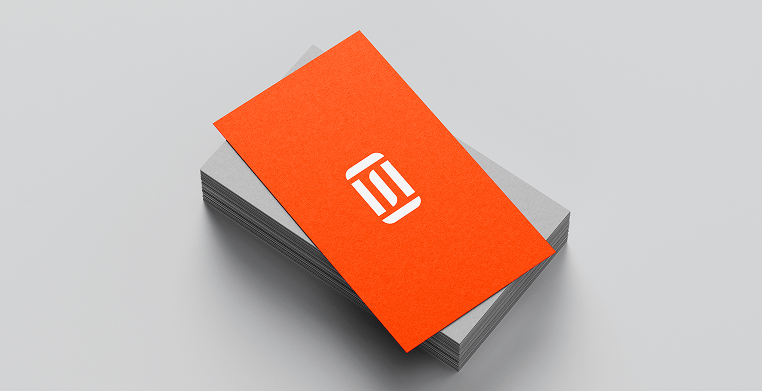
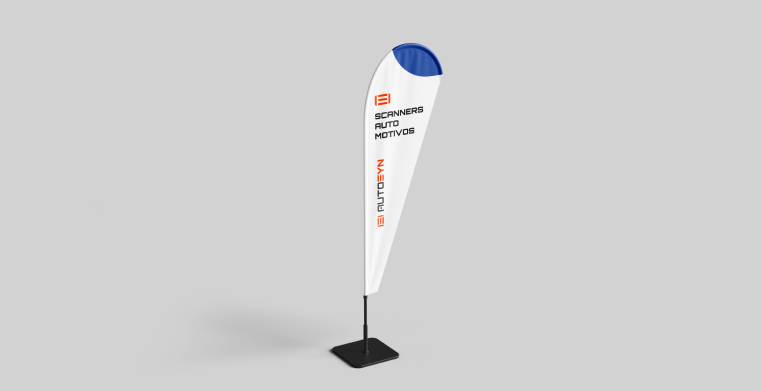
From there, I created the entire visual identity system: color palette, typography, graphic style, logo, and brand applications. The chosen primary color — a vibrant orange-red — was defined through strategic discussions to reflect energy, technology, and high visibility within the automotive electronics market.With the identity finalized, I extended the visual system into the full e-commerce build, designing social media banners, product graphics, and all interface visuals to ensure a cohesive and professional brand presence.
The client was extremely satisfied with the final result, which positioned AUTOSYN for growth with a solid, modern, and distinctive brand.